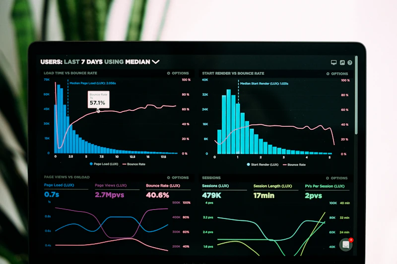
Stack Hero
A split hero with a checklist on one side and a fanned stack of screenshots on a drifting mesh-gradient stage on the other, framed by design-tool rulers.

Installation
Full Setup guideInstall the component automatically via Shadcn CLI.
npx shadcn@latest add https://www.grettech.com/api/registry/stack-heroProps
| Prop | Type | Default | Description |
|---|---|---|---|
title* | React.ReactNode | - | The main headline. Wrap part of it in a muted span for a two-tone title. |
images* | StackImage[] | - | Up to three screenshots; the first sits in front. |
eyebrow | string | - | Small label above the title. |
description | string | - | Supporting text under the title. |
points | string[] | [] | Short benefits, shown as a checklist. |
children | React.ReactNode | - | Calls to action. |
note | string | - | Small print under the actions. |
reverse | boolean | false | Put the screenshots on the left. |
rulers | boolean | true | Ruler marks along the edges. |
colors | [string, string, string] | ["#38bdf8", "#a78bfa", "#f472b6"] | Three colours for the mesh gradient behind the screenshots. |
className | string | - | Extra classes for the section. |